


black bear diner
mobile app | full case study
The Introduction
Black Bear Diner is a community-oriented, family bear-themed restaurant that currently outsources their online ordering to a third party organization. I tasked myself with designing a mobile app for busy folks who have to find making their usual orders challenging. Using a Group Order feature, Allergen Indicators, and a very visual menu resulted in users being able to quickly create a complicated food order to the diner like it was nothing.
Black Bear Diner is a community-oriented, family bear-themed restaurant that currently outsources their online ordering to a third party organization. I tasked myself with designing a mobile app for busy folks who have to find making their usual orders challenging. Using a Group Order feature, Allergen Indicators, and a very visual menu resulted in users being able to quickly create a complicated food order to the diner like it was nothing.
Scope & Responsibility
Siah Harper, Lead UX Designer.
September 2022 → August 2023
September 2022 → August 2023
• User Researcher
• Interaction Designer
• Visual Designer
• Motion Designer
• Interaction Designer
• Visual Designer
• Motion Designer

Reminder: click images to see them larger.
The Problem & the Goal
Currently, users must order through a third party integration. While it performs its function, it doesn’t allow the Black Bear Diner to create a memorable experience with features that specifically cater to their diners.
I set out to design a mobile app for Black Bear Diner that creates an enhanced experience for the user with new features like a group order, nutrition/allergen information, and order history features.
The project’s inception stemmed from this question:

As you will see, I do successfully find ways of empower users to confidently order food remotely. During the process I learned, perhaps, the most valuable lesson in my career thus far: set the scope of a project early.
The Process

Who Are We Feeding?
Initial Research
I spoke to four individuals who frequent Black Bear Diner. They hold valuable insights because they are aware of existing problems with online ordering, selecting food from a menu, and what challenges them in-store.


Our research interviewed a userbase who were previous customers, used to eat at the diner, careful spenders, special diets, without a car, without a debit card, little local area knowledge, or described themselves as worried or indecisive when ordering.
User Problems
• Hectic to order during rush hour
• Don’t have time to cook
• Difficult to make complicated orders
• Convenient to sacrifice their wants
• Mistakes negatively impact them
• Uncertain about order accuracy
• Difficulty reading menu
• Cooking at home is more convenient
• Don’t have time to cook
• Difficult to make complicated orders
• Convenient to sacrifice their wants
• Mistakes negatively impact them
• Uncertain about order accuracy
• Difficulty reading menu
• Cooking at home is more convenient
Project Success
The project will be considered successful when two rounds of user usability testing has been conducted to create a fully functional order flow has been designed for a mobile app.
What are the Bear Necessities?
Defining the Problems
Before starting anything else, I created a sitemap plan for the structure of the app's pages.

To clearly define the problems, I had to create a clear image of the user in my mind. Meet our two Personas: Arman and Laorna.


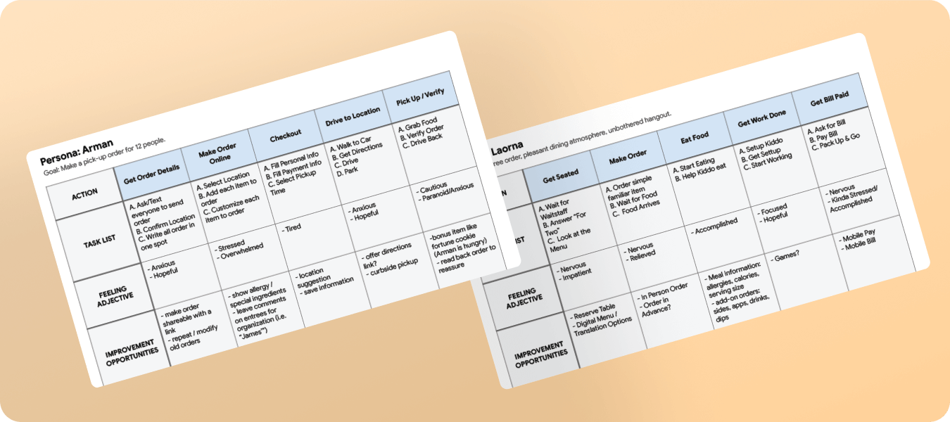
Personas Hypothesis Statements
Laorna is a tired mom pursuing a degree and profession life who benefits from:
Arman is an ambitious, hard-working, new employee who benefits from:

Product Goal Statements

Work Smarter, Not Harder
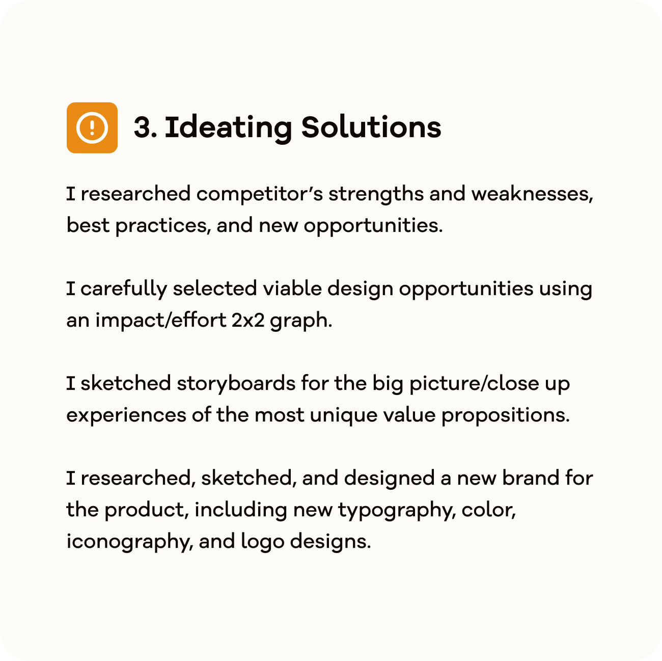
Ideating Solutions

Competitive Audit Goals
The first step ideating solutions was conducting a competitive audit to define best practices for UI design, restaurant order features, and information structure/layout.
Key competitors I analyzed were Mel’s Diner, Chipotle, Chili’s, and Wing-Stop. Mel’s Diner is a direct competitor, while Chipotle, Chili’s, and Wing-Stop are indirect competitors.
Key competitors I analyzed were Mel’s Diner, Chipotle, Chili’s, and Wing-Stop. Mel’s Diner is a direct competitor, while Chipotle, Chili’s, and Wing-Stop are indirect competitors.

Key Insights from Competitive Audit
• Making the ordering experience more exciting, visual, and rewarding is essential.
• Ensuring the user has access to nutritional information and regular information through readable type size and language options is a must.
• Chipotle’s greatest strength is their innovative features, brand identity, and consistent layout / organization: lots to take inspiration from.
• Too flashy of pages with beautifully animated type may not be readable by screen readers. Using alternate text enhances the overall experience for everyone.

User Pain Points
Hectic to order during rush hours →
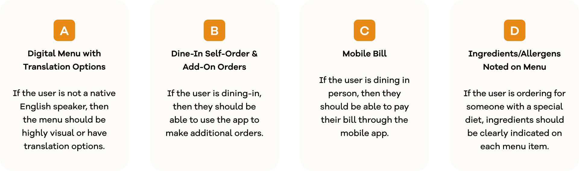
Product Opportunities
• One tap order
• Dine-in self-order & add-on order
• Pay dine-in bill
• Dine-in self-order & add-on order
• Pay dine-in bill
Don't have time to waste →
• Curbside pickup
• Saved information
• Locations suggestion
• Saved information
• Locations suggestion
Difficult to make complicated orders →
• Labeling your order
• Group order
• Food info/allergens available
• Group order
• Food info/allergens available
Difficult to read menu →
• Language options
• Having a visual layout
• Having a visual layout
Inconvenient leaving home →
• Seamless transition to directions
There were 12 opportunities I noted to make Black Bear Diner remote orders fantastic. I decided to move forward primarily focusing on Arman’s experience. This helped me prioritize 7 well designed features instead of 12 hastily half-designed features.
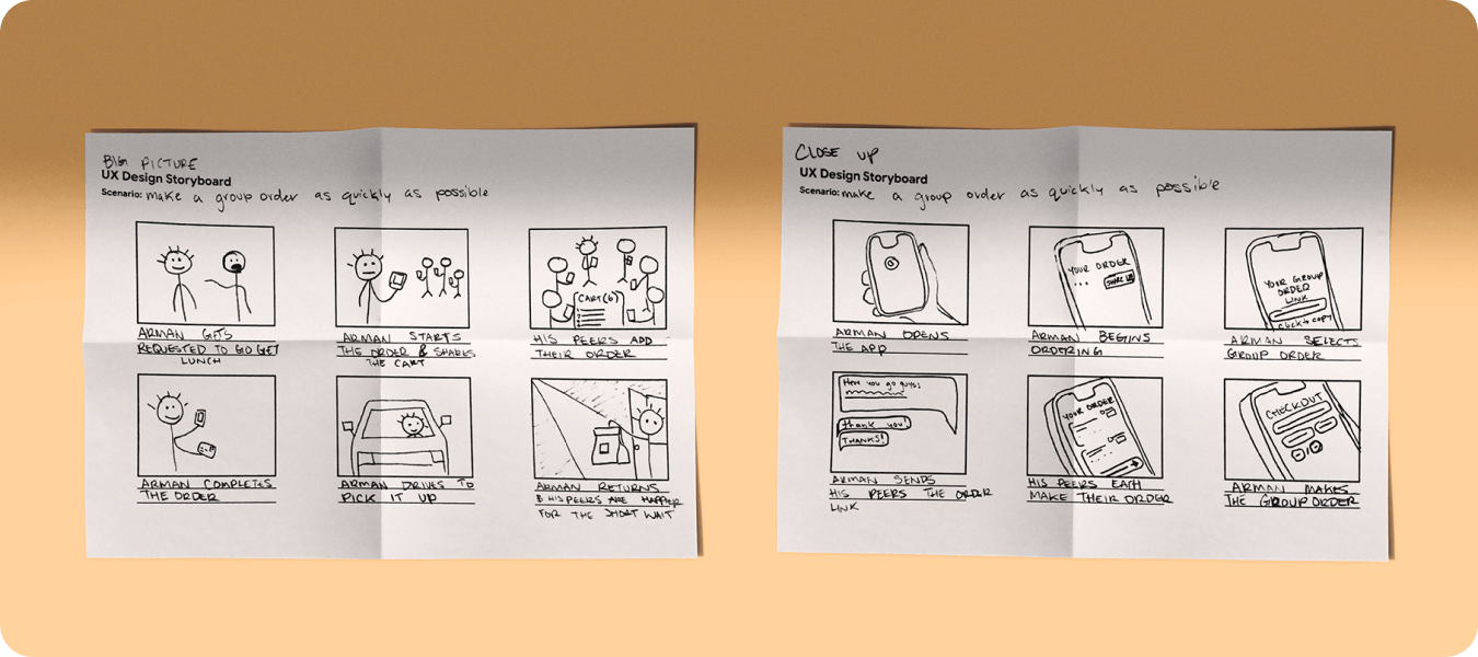
Sketching Solutions with Storyboards
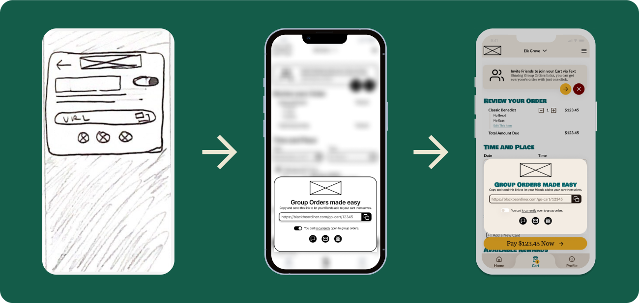
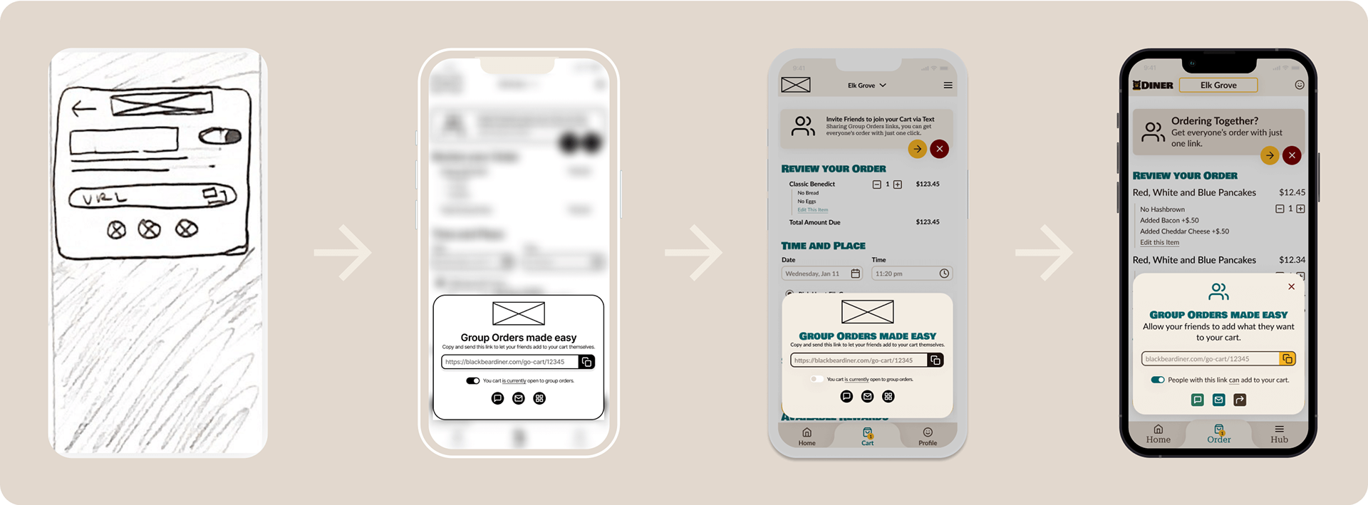
Sketching storyboards for the big picture, allowed for me to imagine in both a macro and micro level what this experience would look like. In the case of the Group Order, it helped distill the functionality of the feature to six key steps.
Black Bear Diner Logo Redesign
I found Black Bear Diner's branding well-crafted, using playful colors effectively to convey the regional effects and their bear’s life theme. However, their mark seemed outdated and less intentional than other parts of their brand identity. I explored a new logo direction and some accompanied branding.


Black Bear Diner Branding


Getting Caught Up in the Visuals
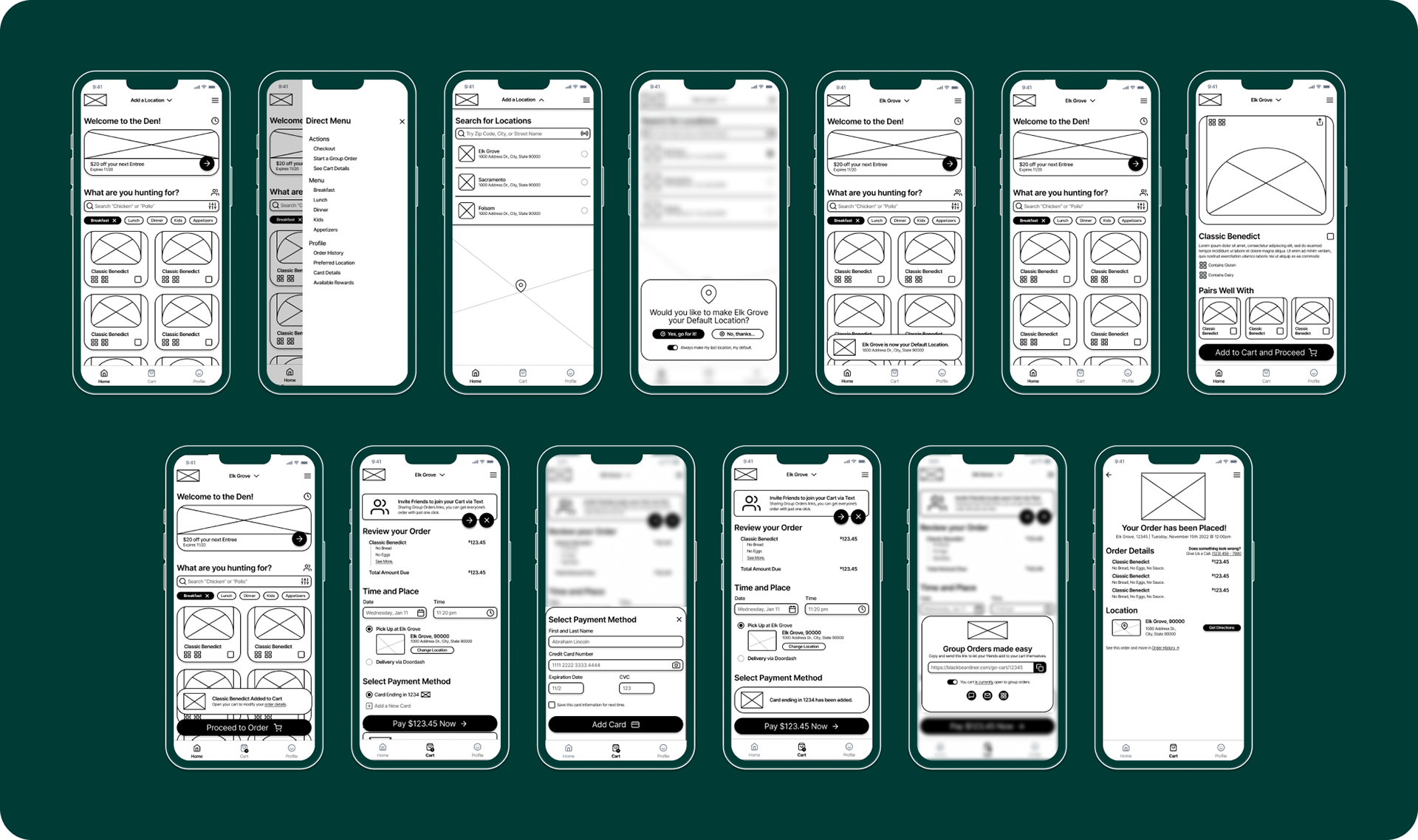
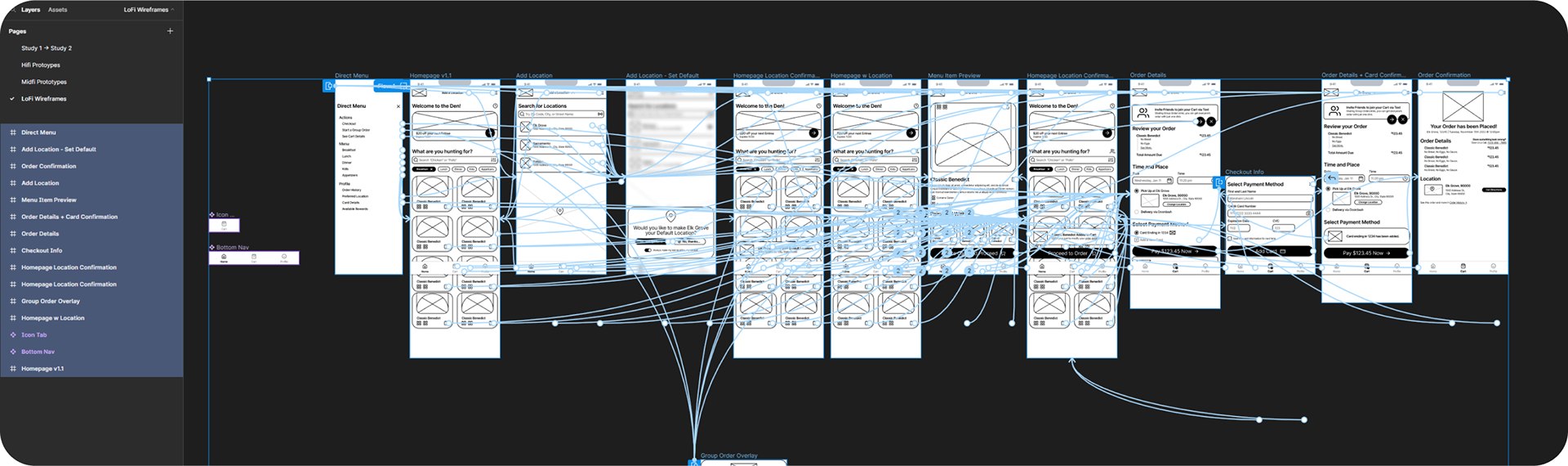
LoFi Wireframes
LoFi Wireframes
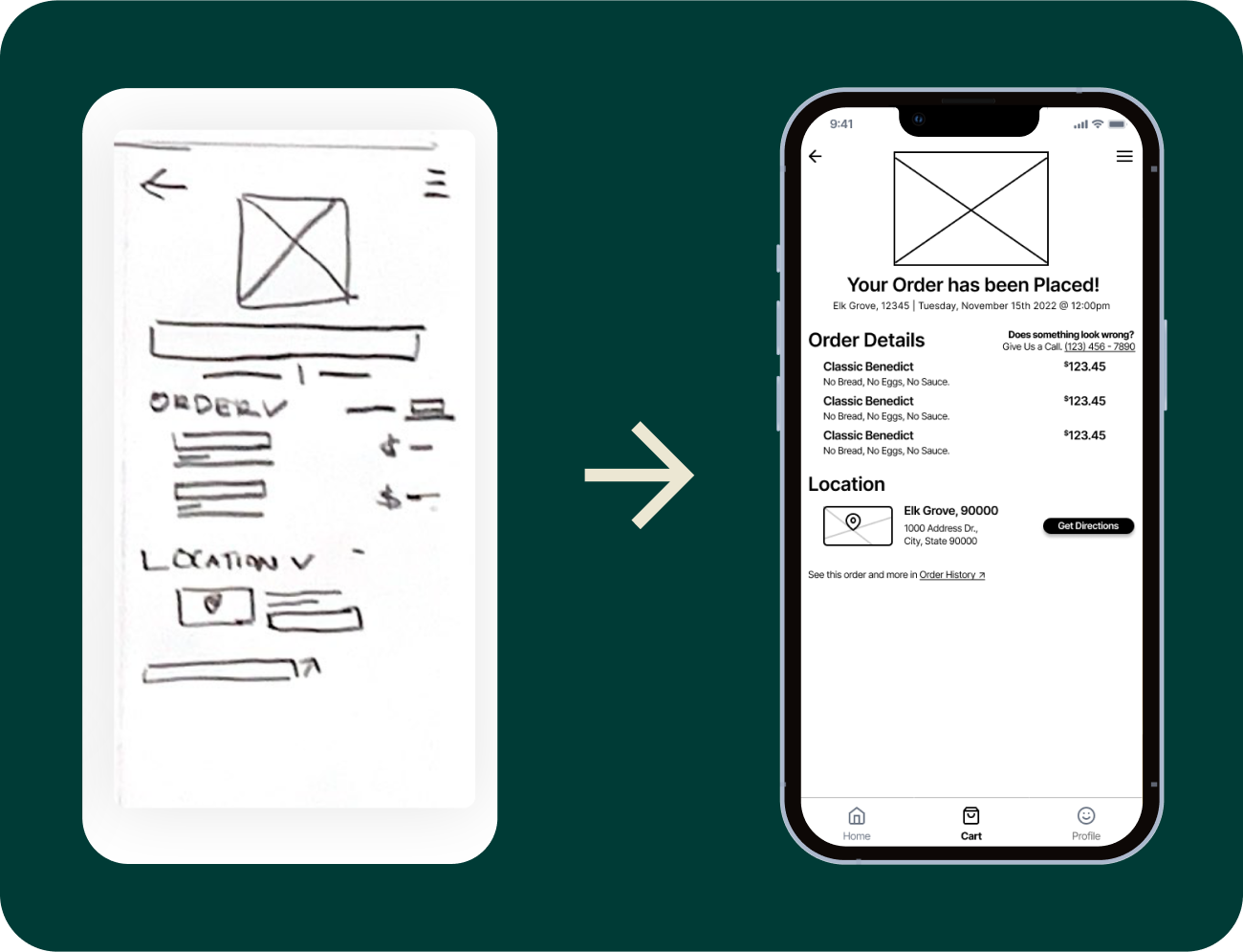
Paper Sketched Wireframes
I sketched five variations for each screen throughout the user’s process. Then, I highlighted the best parts of each variations and combined them into one final master sketch.


Digital Wireframes
After creating each master sketch, I took them into Figma to design digital wireframes to see the user experience begin to unfold.

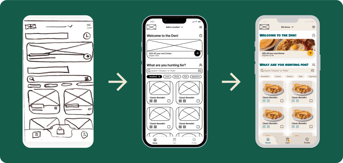
During the project, I discovered the importance of restraint in creating LoFi wireframes. I had the tendency to over-design low fidelity prototypes, making functional changes challenging once design choices were finalized.
I learned to prioritize user-centric design over aesthetics. Despite this, many design decisions from the low fidelity wireframes persisted till the project's end.
I learned to prioritize user-centric design over aesthetics. Despite this, many design decisions from the low fidelity wireframes persisted till the project's end.


“What Is a Group Order?”
Conducted Research

I conducted a remote moderated usability study to learn more about how users prefer to engage with remote ordering, what their familiarity is with “group orders,” and how special edge cases are. I chose five participants of varying backgrounds to perform tasks in the low-fidelity prototype.
You can test the low-fidelity prototype yourself here.
You can test the low-fidelity prototype yourself here.


Research Insights
Here’s what user’s said about the low fidelity prototypes:

Moving forward I marked the following high-priority changes:
1. Include a short onboarding stage where unique features can be explained in advance.
2. Avoid using large interactive CTAs for elements that do not promote important actions.
3. Include small notifications to confirm the success of the user’s actions.
4. Add an “order details” screen that shows the order details and total amount due.
• Add a start group orders buttons on this new page and in the hamburger menu.
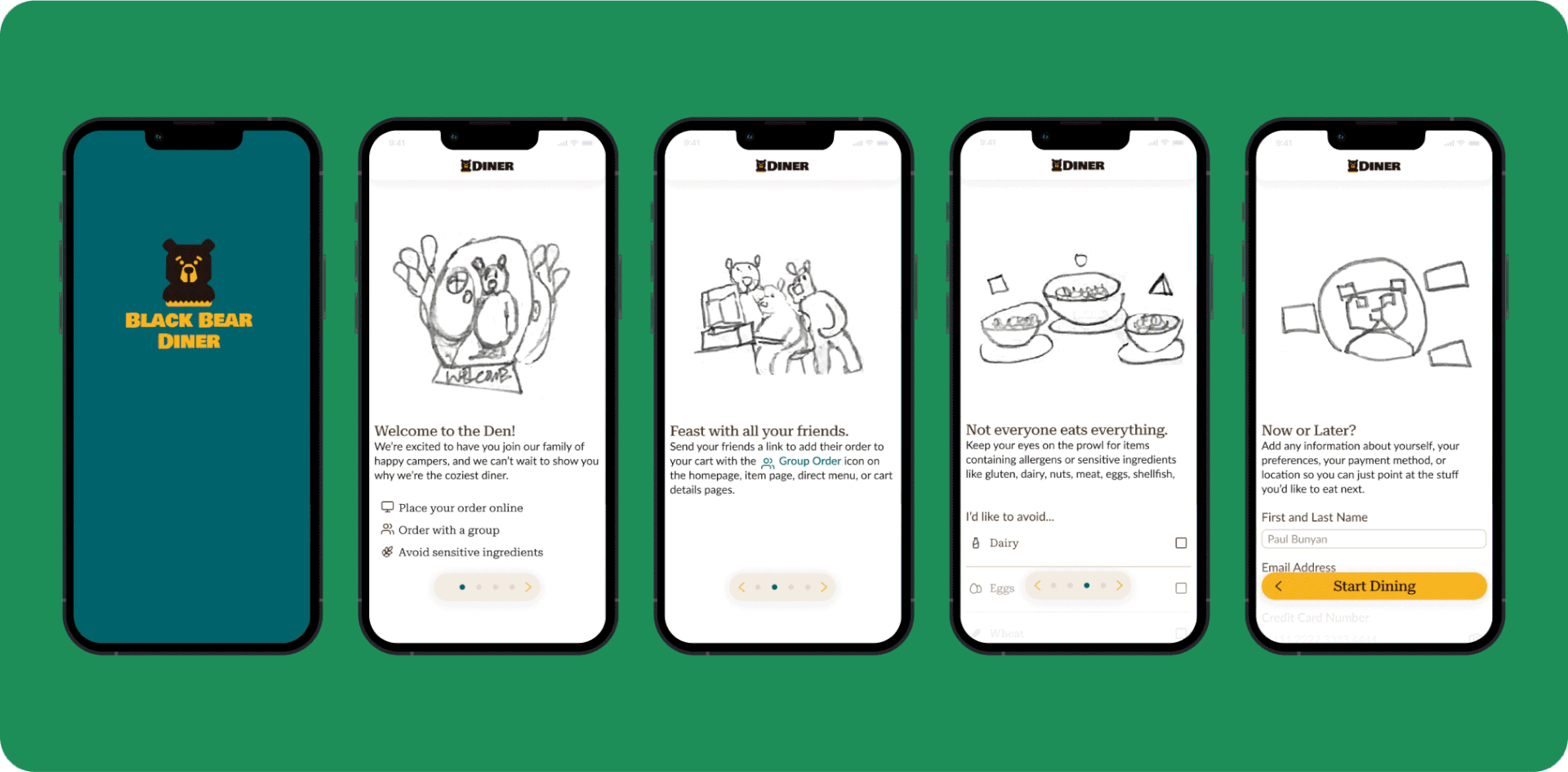
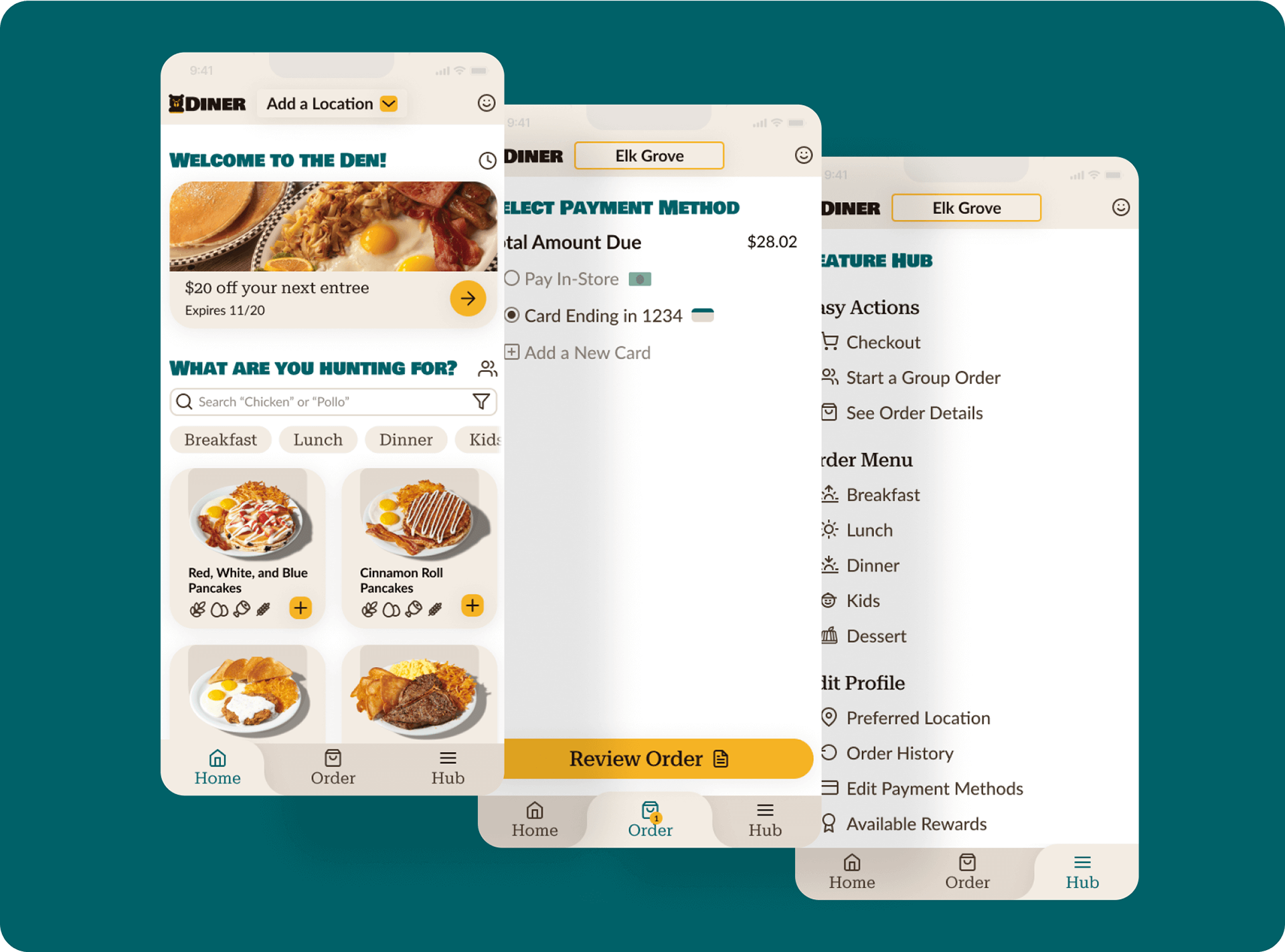
Welcome to the Den
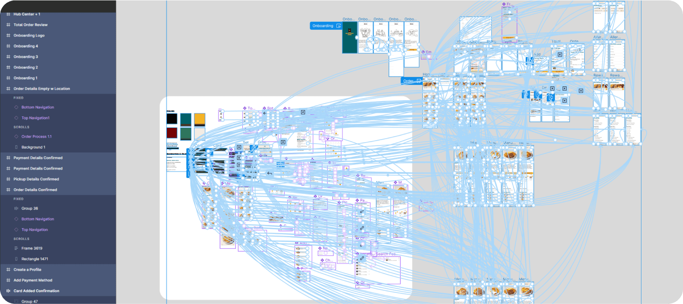
MidFi Prototype
MidFi Prototype
You can test the medium-fidelity prototype yourself here.


Biting Off More Than I Can Chew
Conducted Research Again
Conducted Research Again
I conducted additional testing to understand how customers use food-ordering apps. The goal was to find out customers' thoughts on ordering, the app's ease of use, potential improvements, and how long it takes to complete orders.
The testing involved two small usability studies: one remote and unmoderated, the other in-person and moderated, with a total of six diverse participants. I used metrics such as time on task, user error rates, system usability scale, and net promoter score to gauge the app's performance.
The testing involved two small usability studies: one remote and unmoderated, the other in-person and moderated, with a total of six diverse participants. I used metrics such as time on task, user error rates, system usability scale, and net promoter score to gauge the app's performance.


Research Insights
Here’s what users said about the MidFi Prototypes:
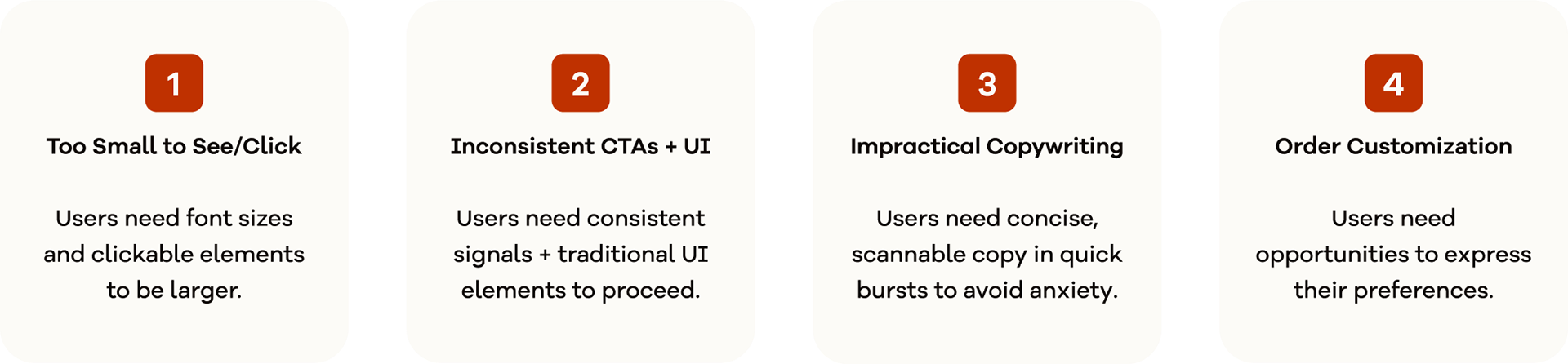
Moving forward I marked the following high priority changes:
1. Increase the size of copy to be no smaller than 15pts with 1.5 spacing.
2. Increase the size of clickable elements to be at least 50px in their smallest dimensions.
3. Add a CTA color to every clickable element no matter how small. (Yellow)
4. Replace the toggle UI elements with a checkbox for the “add to cart” function.
5. Rewrite concise headers so users can better understand their content’s context.
6. Reorganize the information of the order details page into several less crowded pages.
7. Create custom order options for selecting your menu item.
An Overwhelming Wealth of Fantastic Opportunities
In the first round of testing I encountered around 10 amazing new opportunities. However, the main challenge wasn't understanding user needs or generating ideas, but rather limiting the project's scope for a freelance UX project.
Despite having 30 potential opportunities, I realized that many of them only slightly addressed user pain points. The tough lesson learned was the necessity to let go of good opportunities, especially in projects with indefinite timelines and no budget constraints.

Bear with Me
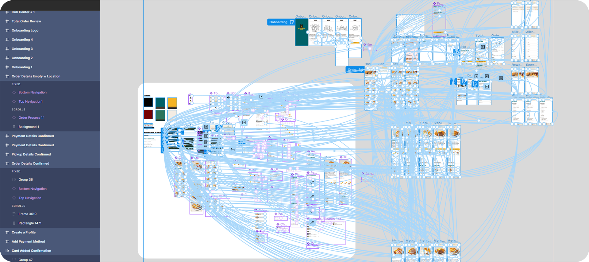
HiFi Prototypes
You can see the high-fidelity prototype in action here.
Diner-Time!
Final Results


The Conclusion
Here’s a summary of the whole process.


Accessibility Considerations

User Pain Points
Hectic to order during rush hours →
Hectic to order during rush hours →
Designed Solution
• Dine-in self-order & add-on order
• Dine-in self-order & add-on order
Don’t have to time to waste →
• Location selection with default and nearby location features
• Checkout process can save user info
• Checkout process can save user info
Difficult to make complicated orders →
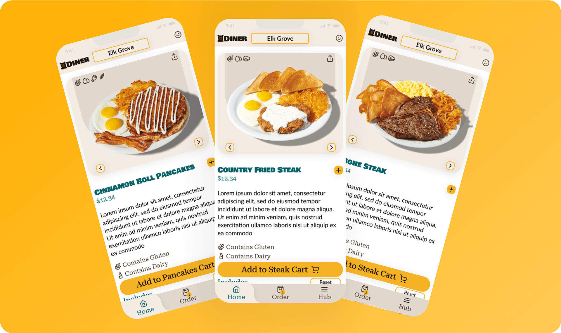
• The menu includes ingredient and allergen information
• Group Order for multi-person orders
• Group Order for multi-person orders
Desire to make custom orders →
• Custom ingredients + comment field
Difficulty reading menu →
• Each screen has a light, spacious, and highly visual layout
• Each step in the order process gets its own screen
• Each step in the order process gets its own screen
Unsure of successfully finished tasks →
• Notifications about success/failure
Inconvenient leaving home →
• Post-checkout has a direction CTA


This Project Taught Me I Should:
• Refocus the user by reviewing research at the beginning of each stage in the process.
• Clarify the project scope prior to initiating any design phase.
• Emphasize the user experience over premature app development.
• Employ shorter design intervals to maintain a holistic perspective.
Next Steps
I would answer the following questions:
• What does it look like to make an account?
• How does the primary user know who ordered what?
• What does it look like for a friend to make their order?
• What does it look like to order on the app, while dining-in?
• What does it look like for the primary user, when a friend adds their order?
• What new pain points can be addressed to make ordering easier in every context?
• How can the user keep track of order histories and their friends’ usual orders?
• Which users are not being serviced by the current design?
My habit of jumping to ideation again after design left me tired, confused, and drawing in so many ideas that the initial idea was forgotten; to make the user feel capable and comfortable.
This project changed the way I viewed design. I better understand the importance of setting scope, foundational research, and prioritizing opportunities to avoid implementing new features late in a design sprint.