

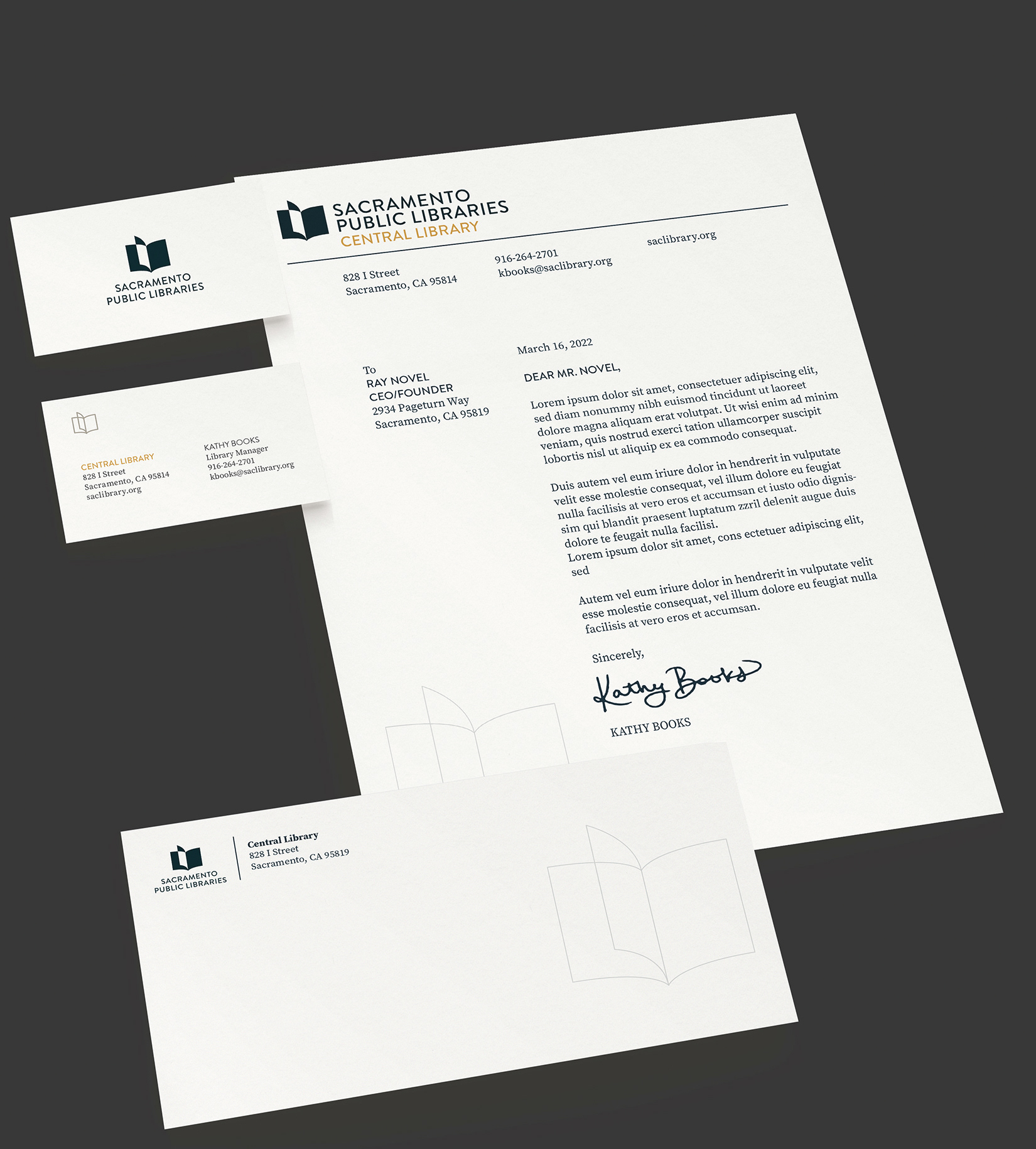
I led this rebrand with three other peers of mine. Collectively, all four of us collaborated to create the branding and business system. I was most involved in designing the primary mark, email campaign, landing page, search terminal, and motion design.
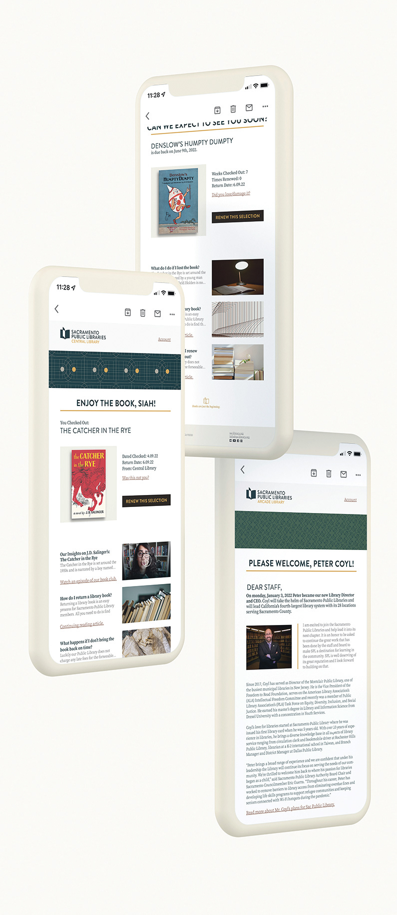

The first step to solving our user engagement problem was by restraining the design to fit the brand’s tone of voice: adaptable, metropolitan, inspiring, resourceful, and introspective.
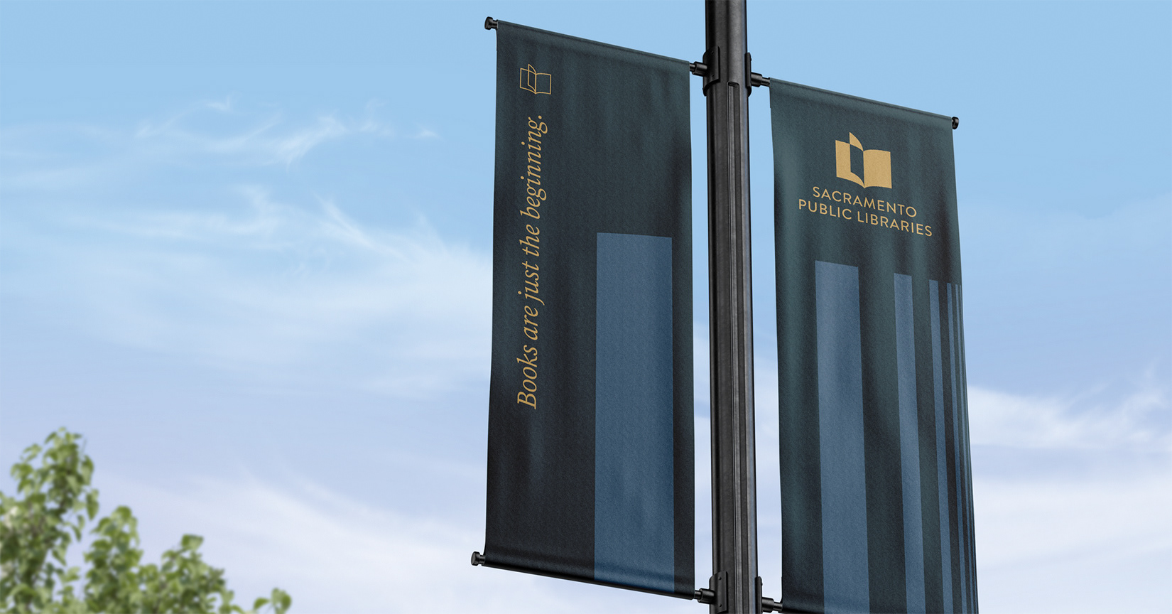
Our second problem of awareness was partially solved alongside our first solution; it created a precedent that services should come first in nearly anything the library does. Our final solution was possibly our simplest. We changed the name from Sacramento Public Library to Sacramento Public Libraries indicating that there are more than one.
Our diligent research showed that even employees felt as though their company’s brand did not showcase their mission for compassion and resourcefulness. Now, the brand focuses on modern elegance with a golden thread to highlight their historical importance.

Our all-encompassing solution was to create the perception that this space was accessible to everyone from a wide range of cultures and counties. We chose elements such as color, pattern, and typography with this in mind.

Read the full Sacramento Public Libraries Brand Guidelines here: