


fairchoices
site redesign
An Introduction
Scope & Responsibility
Siah Harper, Lead UX Designer.
April 2024 → May 2024 (1mo)
April 2024 → May 2024 (1mo)
• UX Researcher
• Visual Designer
• Interaction Designer
• WordPress Front-End Developer
• Visual Designer
• Interaction Designer
• WordPress Front-End Developer

Reminder: click images to see them larger.
The Project Brief
FairChoices is a tool developed by Bergen Centre for Ethics and Priority Setting in Health (BCEPS) and the University of Bergen (UiB) to help policymakers and researchers create strategic and efficient intervention plans for low-middle income countries.
I was asked to design a website for students, professors, and faculty informing the world:
• How to use the FairChoices tool
• The intervention projects of BCEPS
• The policies made by BCEPS and partners
This project had real stakes to me because not only was I very excited to work with the University of Bergen, there were opportunities to continue working together if all went well.
Additionally this project, was intended for a student and thus had the budget of one. This meant I couldn't spend endless time on things. Although I had wanted to over-deliver to make a good impression, I had to be careful with how I spent my time.
Timeframe: Must complete in 4 weeks: I can only utilize quick/effective research methods.
Technical: Must use WordPress: I can only design with CMS blocks and custom CSS.
Technical: Must use WordPress: I can only design with CMS blocks and custom CSS.
Usability: Must be easy to use by non-designers: simplicity wins over cleverness.
A Project Overview
The Process


Why Change Now?
Initial Problems
During my initial interviews with BCEPS several problems were brought to my attention. They felt their service needed the following problems solved in the final solution:

1. To have stronger branding / design systems in line with university guidelines

2. To allow for easy modifications by non-designers

3. To look “nice” and “serious” and “professional.”
We'll come back to these adjectives later.
4. To remove/update unfinished live pages and update inaccurate and confusing copy

5. To streamline the user journey for students to find academic resources


I completed a Heuristic Markup to assess what the FairChoices was doing well and where else the site could use improvement. My biggest takeaways were:
• Say more with less. Professors love to use many big words to thoroughly convey ideas.
• Attention to detail. Many pages were left unfinished with placeholder copy.
• Accessibility. Failing contrast, inconsistent CTA colors, and doesn't function on mobile.

Sugested Improved Site Map Structure
Many of these insights were further proven by a reorganization of the sitemap’s hierarchy.
• Unfinished. Many pages are dead links.
• Unexpected. Links to different sites were not conveyed differently than local links.
• Unclear. Nav dropdowns had indecipherable choices like “Our Teams” vs “Team Members”

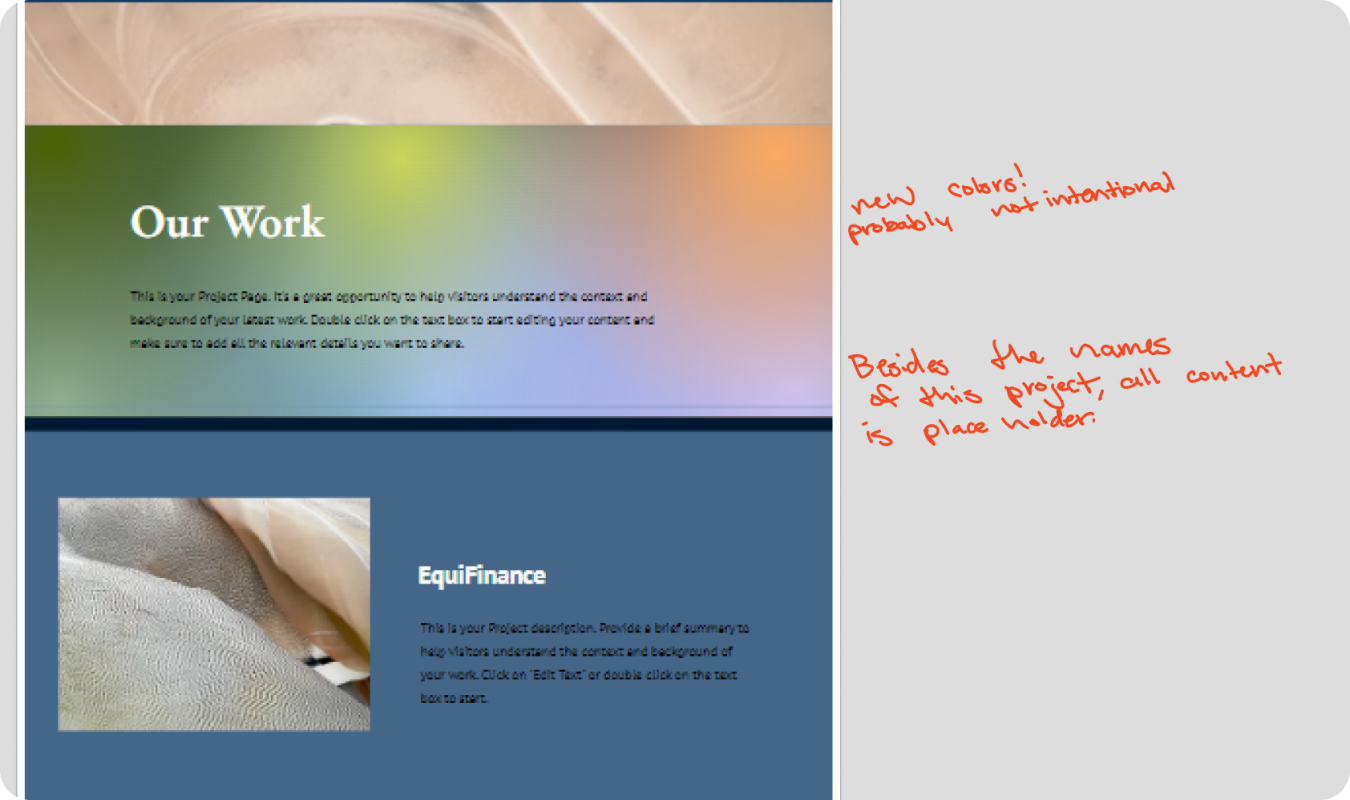
The original FairChoices site design.
Discovering Success before Discovering Solutions
I needed to reevaluate the vague goals of feeling “nice,” “serious,” and “professional.” BCEPS expanded upon that list saying they wanted the site to feel: professional, trustworthy, thought-provoking, fun, ambitious, respects (vulnerable population in policy), and complicated but manageable.
So I asked them if the following would suffice not only as qualifiable measurements for success but also to visually uphold their moral principles:
Design Principles
Compassionate. FairChoices has their heart in helping as many people as possible.
Engaging. FairChoices finds unique ways to illuminate and explain concepts.
Thoughtful. FairChoices transforms data into concise themes for everyone to understand.
Professional. FairChoices is respectable, trustworthy, and competent.
Possible Actions
→ Accessibility is a first priority.
→ Authentic poorer countries representation.
→ Skim-able layout design
→ Highlighting collaborative efforts
→ Using simplicity to easily engage users
→ Highlight impactful information
→ Design that feels academic (dressy casual)
→ Avoid disrespecting vulnerable populations.
The BCEPS team felt this list aptly described the goals of FairChoices.
Who Needs Our Design Help?
Problem Statements & User Stories
After interviewing faculty, professors, and students, I created the following personas and user stories.

Professor Peter needs to be able to update the website easily because he is not super technologically or visually inclined.
As a professor, I want to be able to only focus on the content of the site, so students find valuable content in an engaging and consumable way.

Student Sarah needs FairChoices to be clear and concise because she is not doing well in professor’s class and was really counting on these resources to help improve their grades.
As a student, I want to be able to easily navigate the site, so that I can learn the importance of the subject matter and do well in this class.

Minister Maria needs to confidently comprehend who FairChoices is and what they do because she and her colleagues have the heavy duty to make policies that better the world.
As a minister with the Ministry of Health, I want to be able to recommend the site to my colleagues, so that everyone can see the value in optimally offering foreign aid.
Sparking Trust at a Glance
Using Branding to Improve Credibility, Impress New Visitors, and Meet Parameters
As part of my initial evaluation included some feedback about how the FairChoices mark could be improved:
Notes for Improvement
• legibility
• simplicity
• scalability• hierarchy
Methods
→ less "muddy" dots = more professional
→ simpler icon = more clear design elements
→ new icon will work great at smaller sizes
→ created harmony between icon and type
→ simpler icon = more clear design elements
→ new icon will work great at smaller sizes
→ created harmony between icon and type


Going Above and Beyond
They enthusiastically agreed and while the mark was not included in the initial project brief, it was an efficient solution to improve site credibility and allow FairChoices to feel more compassionate, thoughtful, engaging, and professional.
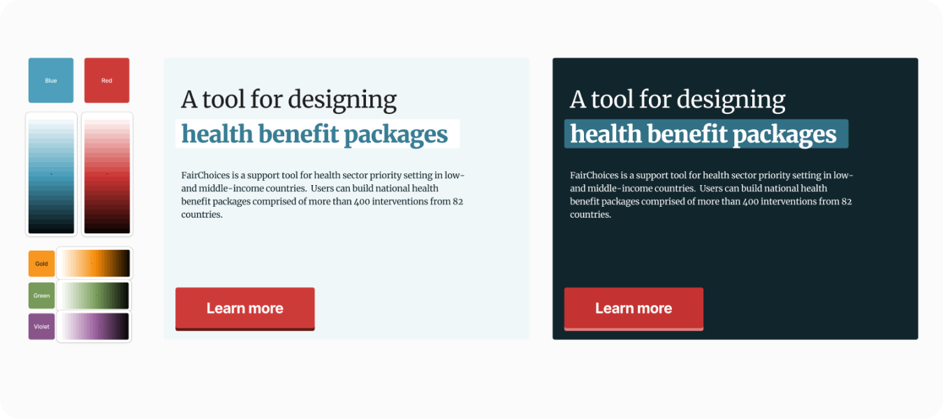
Now FairChoices had a simple 5-minute Design System that even busy faculty could adhere to because it consisted of a CTA color, background/foreground colors combinations, and some templatized typography designs using CSS.
The blue reflects a trustworthy, prestigious, and professional institution.
The red reflects medical treatment, health, research, and academia. (UiB and BCEPS)
Research Interview Insights
Iterative Design Process
I conducted several interviews with stakeholders and students to get insights during the creation of the site. Here are some important insights that were discovered:
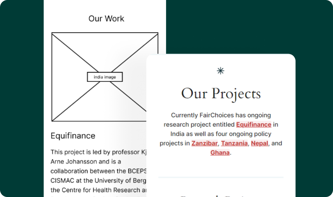
• Placing “Our Work” section inside of the “Methodology” page was not helpful to policymakers, like Maria, who use previous success stories to predict the risk of recommending the tool. FairChoices needed it’s own “Projects” page to list the successful history of work.
• Database pages like the Classroom videos or essay pages would benefit from a sticky Table of Contents block to navigate around quickly.
• It was redundant to host “Team Member” pages, when the information was copied from the University faculty pages. We opted to instead link any members page to the University.


The Final Results
See the CMS website and respectable brand the client bragged about to all their friends!


Before/After Comparison


See the new and improved FairChoices site live here.
The live site reflects changes the BCEPS team has made independently since the end of our contract.
The live site reflects changes the BCEPS team has made independently since the end of our contract.
Presenting Final Designs to FairChoices Staff
I presented and demonstrated the final designs built in WordPress. They were very engaged audience members with great questions about implementation, follow-up, and even invited me to work with them the following semester.


First I established the identity we sought to display.

I mentioned some problems currently facing the site.

I explained the success criteria we had agreed to.

We can see suggested new mark which had yet to be seen.

Here I discussed the improved mark in small contexts.

From this point I transitioned to demonstrating the site in real time.
This case study is still being written! I plan to show more wireframes, videos, and solutions of the final work. In the final case study I defend my design choices, mention how I considered accessibility, and name some objectives for what I'd like to do better next time.