


black bear diner
mobile app
An Introduction
Scope & Responsibility
Siah Harper, Lead UX Designer.
September 2022 → August 2023
September 2022 → August 2023
• User Researcher
• Interaction Designer
• Visual Designer
• Motion Designer
• Interaction Designer
• Visual Designer
• Motion Designer
Do you love to Geek Out on UX Process/Reading?
This is a summarized version of the Black Bear Diner Mobile App project and its process. An in-depth overview is available to those who love to geek out on research details, sketches, and everything in between the initial ideation and the final results.
This is a summarized version of the Black Bear Diner Mobile App project and its process. An in-depth overview is available to those who love to geek out on research details, sketches, and everything in between the initial ideation and the final results.

Reminder: click images to see them larger.
Currently, users must order through an unmemorable and unenjoyable third party integration. While the service works to suit users existing needs, it does not accommodate for future features that anticipate new needs or the needs of under-represented groups.
I set out to improve upon an existing but indifferent mobile restaurant order application.
A Project Overview
The Process


Why Change Now?
Initial Problems
This third party service suffices to work as intended but has two major pitfalls:
• feels unmemorable and inconsistent to branding
• has no potential for features, rewards, or a lasting experience
What Is Known
User Submitted Problems
After conducting interviews with the existing audience, here were the four discovered pain points users are faced with:
• Ordering in-person at rush hour is stressful.
• Users lack time for complex order processes.
• Large/customized orders are time-consuming.
• Large/customized orders are time-consuming.
• Text-heavy menus are difficult to read/use.
Who Needs Our Design Help?
Meeting the Personas

Arman is an ambitious, hard-working, new employee who benefits from:
• Features that aid large group orders
• Apps that saves recurring information
• Instructions on how to do pick-up orders

Laorna is a tired mom pursuing a degree and professional life who benefits from:
• Design helping non-native English speakers
• Features that can be used while dining-in
• Features aiding orders for special diets
How Can We Help Bear Folk
The Mission

The largest problem to arise on this project came from the desire to make a comprehensive app. To make something comprehensive, with no limit for scope, meant I had the opportunity to sink hours into too many new features.
I learned to set a limited scope before I began working.
I learned to set a limited scope before I began working.
User Pain Points
• ordering in-person at rush hour is stressful
• users lack time for complex order processes
• large/customized orders are time-consuming• text-heavy menus are difficult to read/use
Product Opportunities
→ dine-in self-order & add-on order
→ save info & preferences to expedite
→ group order, customize items, allergen info
→ visual card gallery menu
→ dine-in self-order & add-on order
→ save info & preferences to expedite
→ group order, customize items, allergen info
→ visual card gallery menu
Fun + Family Branding
Seeking Consistency With a Rebrand
I designed systems for more memorable
• Logo
• Typography
• Iconography
because of one word in the mission: consistent. Most of the existing brand was designed to feel fun and family-focused. The current logo and the typography did not match the approachable and playful tone that the rest of the brand had created.


What Research Taught Me?
Iterative Design Process
Iterative Design Process
I sketched five variations for each screen throughout the user’s process. Then, I highlighted the best parts of each variations and combined them into one final master sketch.
The most valuable insights resulting from the two UX Usability Studies:
• Created onboarding to introduce custom features.
• Removed redundant steps for a concise process.
• Implemented successful action confirmation notifications for user confidence
• Added order details confirmation page so users can order with confidence.
• Added more order customization to make users feel assured.
• Increased text and button size for fingers to make more enjoyable.
• Organized colors of CTAs for consistency.
• Simplified copywriting for more concise guidance.Diner-Time!
Final Results


Defending Design Choices
Accessibility Considerations

User Pain Points
• ordering in-person at rush hour is stressful
• users lack time for complex order processes
• large/customized orders are time-consuming• text-heavy menus are difficult to read/use
Designed Solutions
→ dine-in self-order & add-on order
→ save info & preferences to expedite
→ group order, customize items, allergen info
→ visual card gallery menu
→ dine-in self-order & add-on order
→ save info & preferences to expedite
→ group order, customize items, allergen info
→ visual card gallery menu
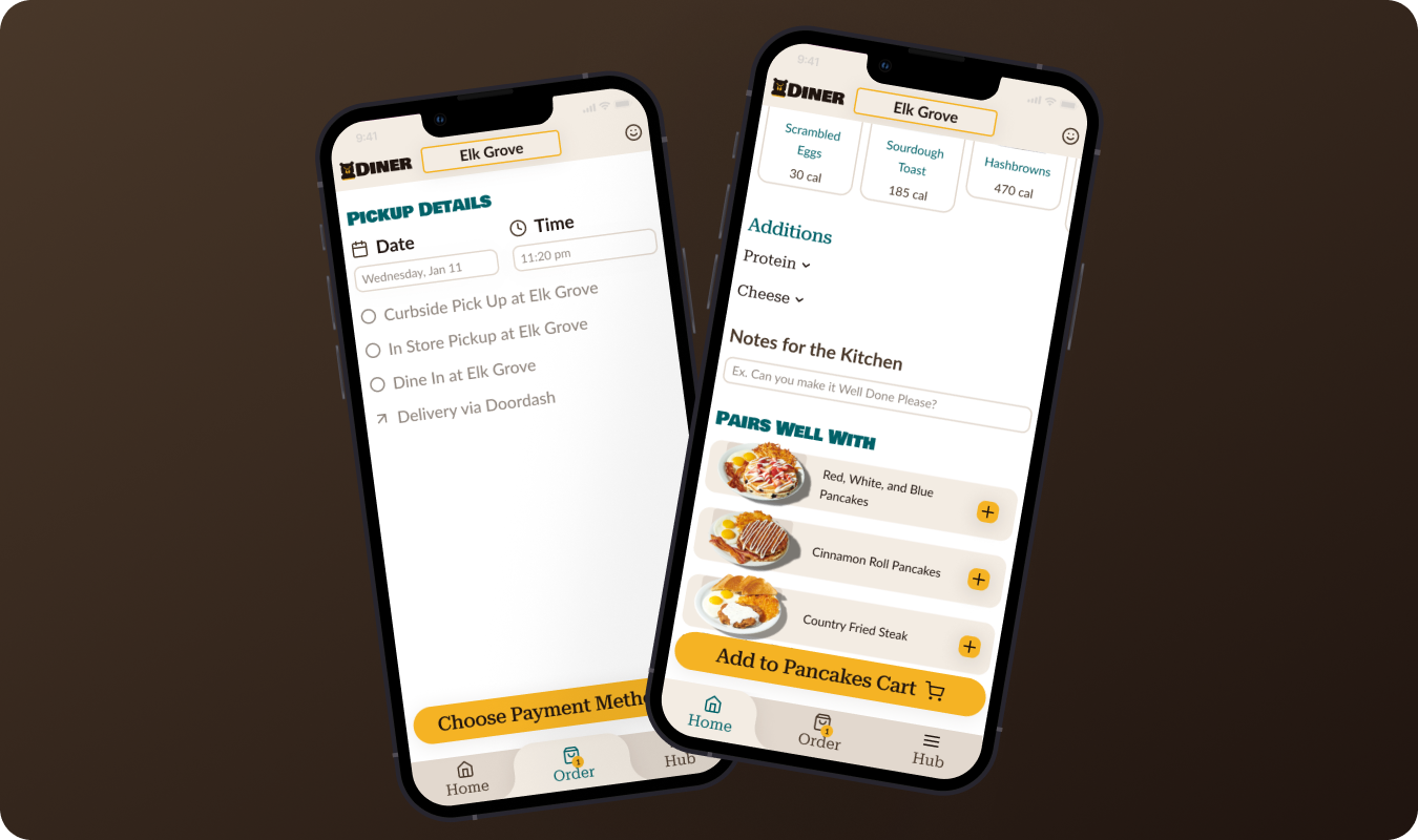
Dine-in Self Order & Add-On Orders to beat Rush Hours
I designed these two features to combat feeling rushed when ordering at a counter in-person. If a user is dining-in, then they should be able to use the app to make their order. Users like Loarna may find this valuable since she can take her time, in private to review her order without the stress of "holding up a line."
I designed these two features to combat feeling rushed when ordering at a counter in-person. If a user is dining-in, then they should be able to use the app to make their order. Users like Loarna may find this valuable since she can take her time, in private to review her order without the stress of "holding up a line."

Saving Profile Info and Preferences to make Ordering Require Less Time
This is likely self-evident. If the user is making orders routinely, they should not have to enter unchanging information repeatedly. Users like Arman may find this useful when he orders more than once a week while busy at work.
This is likely self-evident. If the user is making orders routinely, they should not have to enter unchanging information repeatedly. Users like Arman may find this useful when he orders more than once a week while busy at work.
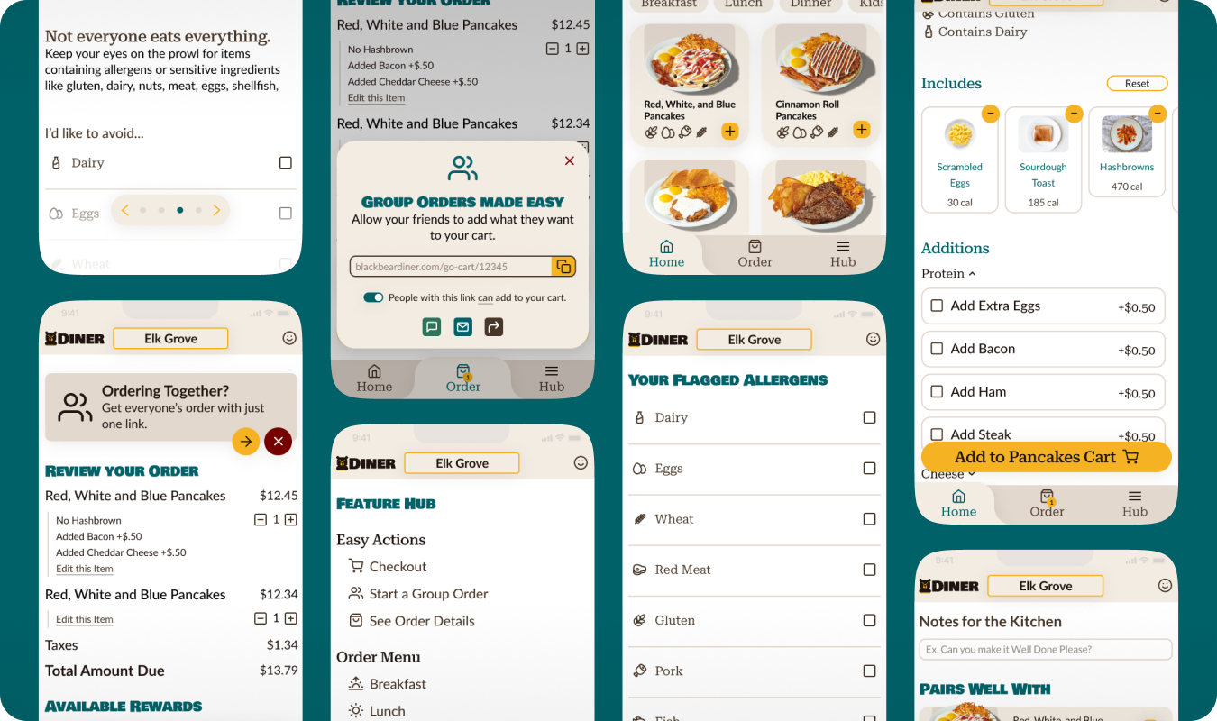
Group Order, Customize Items, Allergen Info Available to streamline Complicated Orders
Every user has a perfect order process in mind; making sure that the application can handle how they wish the order was collected requires a much forethought. If the user need to easily get others' complicated order into one cart, there should be a feature to allow for that.
If the user is ordering for someone with a special diet, ingredients should be clearly indicated and modifiable on each menu item. Users like both, Arman and Loarna find this helpful who routinely order for people other than themselves with unique desires and diets.

Visual Card Gallery to beat Complicated / Busy Menus
The more simple the menu items are displayed, the faster and more intuitively will users complete the process. If users is not a native English speaker, then the menu should be highly visual or have translation options. Users like both, Arman and Loarna find this helpful when browsing through many different menu items and category choices.
The more simple the menu items are displayed, the faster and more intuitively will users complete the process. If users is not a native English speaker, then the menu should be highly visual or have translation options. Users like both, Arman and Loarna find this helpful when browsing through many different menu items and category choices.

Final Takeaways
This Project Taught Me I Should:
• Refocus the user by reviewing research at the beginning of each stage in the process.
• Clarify the project scope prior to initiating any design phase.
• Emphasize the user experience over premature app development.
• Employ shorter design intervals to maintain a holistic perspective.
• Clarify the project scope prior to initiating any design phase.
• Emphasize the user experience over premature app development.
• Employ shorter design intervals to maintain a holistic perspective.
Not Feeling Satisfied Yet?
This is a summarized version of the Black Bear Diner Mobile App project and its process. An in-depth overview is available to those who love to geek out on research details, sketches, and everything in between the initial ideation and the final results.
This is a summarized version of the Black Bear Diner Mobile App project and its process. An in-depth overview is available to those who love to geek out on research details, sketches, and everything in between the initial ideation and the final results.